
Buena Vista Public Library
In 2023 the Buena Vista Public Library called on me for a much needed rebrand. The results lifted the Buena Vista Public Library up as one of the most visually clean, powerful and professional brands amongst Colorado rural libraries.
Before
The original brand in logo was simple and not entirely ineffective – but it certainly doesn’t stand out from other entities around Buena Vista. The colorways clashed and looked a little too focused on the youth programming.
The objective would be to mold the library’s visual to something cleaner with more appeal across demographics.
After
The result is not only cleaner, but stands out amongst the community filled with mountain images, specifically of the nearby Mount Princeton.
The Vision
- Legible at all sizes.
- Usable in full color or mono-color
- Functional as a icon, wordmark or full logo.
- Representative of all members of the community.
- Easy to design with as a system
- Avoid Library logo cliches.
- Avoid mountain imagery.
- Match the aesthetic of the growing town.
Inspirations
Speaks “Colorado” without being over the top or disrespecting the viewer.
Clean, recognizable system based logo which works at scale and in many color motifs.
Logo and work mark which can exist independently of each other
Clean Swiss/international design motifs which represent quality, timelessness and trustworthiness.
Early
Solutions
Like any logo project we went through a variety of ideas. Close communication with library management helped us come together on exactly what visual idea we wanted to follow.
All of these solutions were considered but rejected for a variety of reasons.
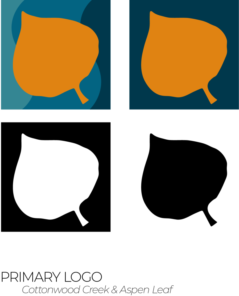
The
Aspen
Icon
We struck gold when we came to the conclusion to use an aspen leaf as our icon.
Aspens represent growth and connectedness as the largest single living organism on earth. They are prolific in the Sawatch Mountains and easily recognizable. In summer, their bright greens invoke peaceful thoughts while fall colors strike awe into lucky viewers. They are quintessentially Colorado. The symbol is relatable to visitors and residents alike. The age and vastness of aspen groves and youthful nature of their saplings speak to the wide age demographic who visits the library. It represents a refreshing departure from the Mt Princeton iconography saturating Buena Vista.
The
Picture
Mark
The Arkansas River and Cottonwood Creek are focal points of Buena Vista. The Ark drives summer whitewater tourism and Cottonwood Creek is a centerpiece of the Library’s idyllic location. They speak to what makes us unique from other libraries around Colorado. Both waterways are abstractly called out in this logo, without force feeding the viewer one specific meaning.
Most importantly, the picture mark, icon and text can all function independently. With the river imagery the project began to fall into place.
Word Mark
& Typography
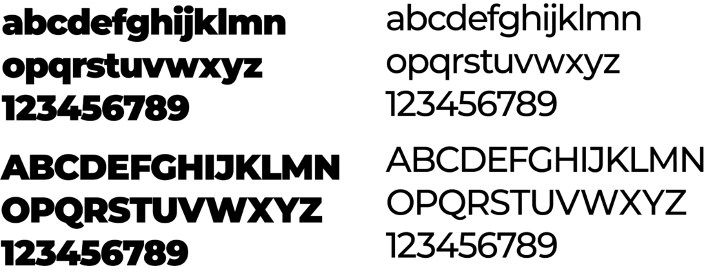
The wordmark is authoritative and geometrical. It is legible. The same font and size is used throughout the design to make one statement “Buena Vista Public Library”. It is neutral but not unfriendly. This type treatment is inspired by public signage around the world.
The brand type face, Montserrat, comes in 28 fonts/weights. Its is versatile, accessible and timeless. It easily meets ADA guidelines and plays well with other fonts. All caps titles command attention and speak to the authority of the Library as an impartial place of education and information.
Word Mark
& Typography
The wordmark is authoritative and geometrical. It is legible. The same font and size is used throughout the design to make one statement “Buena Vista Public Library”. It is neutral but not unfriendly. This type treatment is inspired by public signage around the world.
The brand type face, Montserrat, comes in 28 fonts/weights. Its is versatile, accessible and timeless. It easily meets ADA guidelines and plays well with other fonts. All caps titles command attention and speak to the authority of the Library as an impartial place of education and information.
Color
Blue is trustworthy, clean, youthful and timeless. It reflects the river and mountain culture without excluding those who do not participate in it. A gradation of blue is used to establish depth and movement within designs.
Off white “Midland Tan” and dark grey “Charcoal” can be used to reduce eye strain within designs. Where possible aggressive “true” blacks or whites are avoided. Additionally the tan and black call back to traditional print media. Despite the popularity of Libby, print is not dead.
Lastly, Gold is used as an accent under this color theme. This is to call out the aspen leaf and the history of mining within the Arkansas Valley. It invokes feelings of authority, quality and reliability.
Brand In Use
The final goal was to build a set of brand guidelines to match with the new logo. The last deliverable for the library was a 23 page brand book which outlined exactly how to implement the new brand.
This makes it easy to create artwork, collateral, library cards and a variety of other essential assets all that fit within one distinct brand. All future staff members who are required to create can easily reference the brand guideline and create within a consistent visual framework.
That level of branding sets the library apart among other small libraries with limited budgets. Guidelines can easily be followed across platforms. The distinct visual motifs communicate to the community that a given event or service is coming from the library. Since implementation of the new brand the library has seen an uptick in class attendance and recognition throughout the community
Contact
Think we could work together? Questions about my rates or about a project? Drop me a line!
I make sure my clients receive a hands on approach with solutions catered to their specific design problems. You can contact me via email Cuttsandcouloiurs@gmail.com